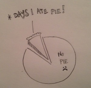
2012 left plenty to be desired. Consider the ultimate pie chart as evidence.
Exhibit A: Days I Ate Pie
Obviously, there’s much room for improvement here. Not nearly enough pie. Considering the deep relaxation I find in making pie dough, I think it’s a clear do-more for 2013.
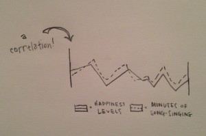
On a more serious note, in sketching out my year in graphs, I uncovered a connection worth noting.
Exhibit B: The Happiness/Song-Singing Correlation
Much to the dismay of my husband, I chronically make-up and sing songs. This is directly connected to a strong belief that life needs a sound track. In middle school, the year book noted: “Can you imagine Sara McGuyer not singing?”
Every year I set a goal to actually write and record songs with Louie. Maybe 2013 will be my year for music.
Here’s a balance I can really use to work on.
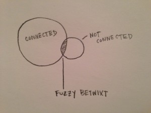
Exhibit C: Connected v. Free
For the purposes of this graph, “Connected” means near my phone or computer, being tuned into incoming email, tweets or other digital notifications. And “Not Connected” means totally unplugged, a.k.a. sleeping, or doing one of the few other activities I enjoy sans tech devices: running, dog-walking or yoga. And “The Fuzzy Betwixt” is that lowly state of checking the iPhone in the morning, half falling asleep while doing it and accidentally dropping phone on face. Raise your hand and admit along side me if you’ve been there.
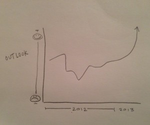
I’m not sure what 2013 holds, but as my last graph shows, the outlook is good.
Exhibit D: Outlook for 2013
This post is part of Think Kit by SmallBox
Today’s prompt: “Draw a pie chart or Venn diagram of your year, possible activities: eating, drinking, sleeping, working, playing.”


